2 minute readImproved
A tidier, more honest dashboard on every screen size
The header names the page you are on, the sidebar shows every section and highlights where you are, and pages that showed sample or placeholder content now show your own data or say plainly what is not available yet.
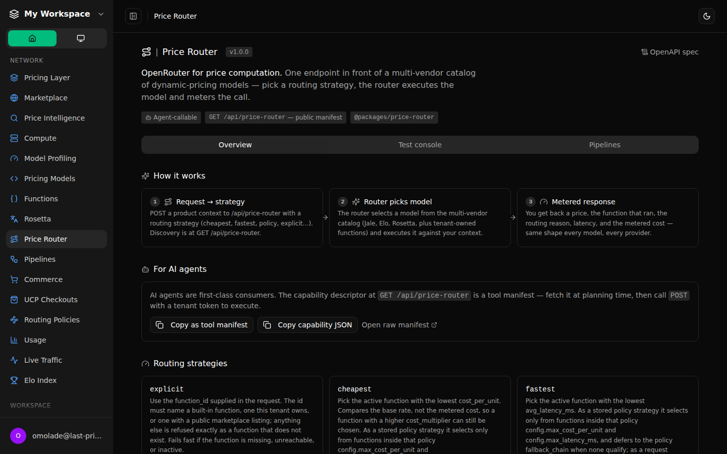
We went through every page of the dashboard and the public site at phone, tablet and desktop widths and fixed what was out of place.
- The header shows the name of the page you are on instead of always saying Home, and the sidebar highlights it.
- Every sidebar section is reachable on smaller screens, and the developer links (Get started, Documentation, API reference, Snippet, Webhooks) now sit together in one section.
- Agent setup no longer fills in a made-up agent when fields are empty, keeps what you typed when you go back a step, and requires a name.
- The sales playbook starts empty with your workspace's name instead of sample text, and says that changes are not saved yet.
- Integrations that cannot connect yet say so instead of pretending.
- The monetization page shows the real steps to bill for an agent.
- Staff pages no longer scroll sideways on phones, and missing values say "Not set".
- Red error text is readable in dark mode.
- Several pages that scrolled sideways or clipped content on phones and tablets now fit, including Price Router, Price Intelligence, Compute, the experiments feature page and Rosetta.
- Demo app cards no longer link to pages that did not open, and say how to get access instead.